Wednesday, February 06, 2013

Moving from brainstorming to doing to learning

Last Friday morning, I found myself with a group of professionals hopping along colored dinosaur tracks strewn along the ground, comparing my standing broad jump mark to a grasshopper’s, and fashioning tiny hand-weights, climbing holds, and stability balls out of clay. This was all in the name of solving real problems real educators face, and it was all before noon.

Welcome to the Schoolyard Scrimmage.

No, it's not a recess brawl or a lunchtime food fight. It's a collaborative problem solving party.

The event, organized by Hi Howard of Front Range BOCES and ReWork, brought professionals from disparate fields (architecture, philanthropy, law) together with education administrators to come up with solutions to real problems using a method called rapid prototyping.


Let’s unpack that a bit. Rapid prototyping is a process for quickly testing out potential solutions and getting real feedback from real people. The central idea is that if you incorporate user feedback (or as I like to call it, real people feedback) into the design process as early as possible, and continue to incorporate it through ideation, refinement, and production, you’ll learn more and get to a good solution more quickly and more efficiently.

Google’s Tom Chi is a rapid prototyping advocate, and we watched a short video where he gave us the hows and whys. Here are a few of his verbal gems:

“Most businesses are just a big guessathon....Don’t guess. Learn.” Chi says that is may feel like guessing is cheaper, but doing is cheaper if you can figure out how to do things quickly.

Don’t fail. Learn. Start-ups like to boast about failing fast, but Chi prefers to call it learning fast. The concept of failure puts you in an uncreative mindset. Ideas that ultimately succeed are often slightly modified versions of things that, technically, were failures.

Don’t argue. Just try it. Chi recommends that if you find yourself discussing whether or not something would work, force yourself to stop talking and start prototyping.
Quotes are better as doodles, right?
Here’s how rapid prototyping works:
  1. As quickly as possible, move from an idea to a working model that approximates it.
  2. Try out the working model on a customer/user (or someone who can stand in for one).
  3. Improve your model based on the feedback and do the process all over again.
For example, you can prototype an interaction by acting out a conversation, you can prototype an information campaign by sketching it up, or you can prototype a physical solution by building it.

Easier said than done, right? At the Schoolyard Scrimmage, we worked in small, pre-determined groups and had a facilitated timeline that forced us to move from the brainstorming/ideation phase to the building phase to the testing phase. We tested and then iterated on two ideas -- so four cycles of rapid prototyping and user feedback. It was fast. And it was difficult. And it was fun.

In my group, working on how an elementary school might offer health and fitness programs in non-traditional spaces, brainstorming came easily. But rapid prototyping is not the same as rapid brainstorming. Finding the right focus that would allow us to prototype, learn, and iterate was the hardest part.

Nonetheless, the event was a success. And we all took home a new challenge: Bring rapid prototyping into our daily work. After few days back at my desk, I’ve found that this process makes sense conceptually, but has been hard to incorporate into my workflow. It’s more of a mental and cultural shift than anything else. But I have become more sensitive to times when we’re steeped in discussion rather than active experimentation, and I’ve been seeking out, and acting on, feedback as much as possible.

Whether it’s hopping along dinosaur tracks, doodling, or simply asking questions and soliciting feedback earlier and more frequently, I hope a rapid prototyping mindset will add a little color and insight to my day.

Best part: Learning - and trying - a new mode of thinking in a group setting.

Hardest part: Moving from ideation into prototyping and testing. For me, the ideation stage is the fun part. But it’s clear the prototyping and testing part is essential for ideas to succeed.

Biggest takeaway: If you find yourself guessing, speculating about, or discussing a problem, that’s great. It’s what we do as humans and it’s part of the creative process. But push yourself to find a quick and dirty way to test your guess. It’ll make your guesses go farther (and it’s also fun).


Monday, January 28, 2013

Playing with Google live forms and beer

I've been taking a course called "Diving Into Data," taught by Lisa Williams, through the Knight Center for Journalism in the Americas. Of course, I've been diving into data for some time now, but class has been fun and I've gotten to play with some fun tools that I haven't had time to experiment on my own, like Processing.

For this week's homework, we're building live forms using Google Drive and creating charts that automatically update based on the responses. I'm pretty predictable, so I made a short survey about craft beer. Click here if you want to take it.

Here are some charts based on the responses I've been getting so far. If everything works (fingers crossed!), these charts should update whenever someone new fills out the survey. This is a good test to see whether Google tools work well together, since Blogger is owned by Google.

I'll be playing with this more (prettifying the charts, adding information like the total number of survey respondents, etc.), but I wanted to get this up there so I can start getting feedback on it. The more interesting data (in my opinion) will be the quantitative data (how much do you spend per week on beer? what do you think is a reasonable price to pay for a beer?). I've set up a spreadsheet that tracks, in real time, the mean, range, and standard deviation of those responses, but haven't yet figured out the best way to display it.

You can see the raw data from the survey here.

And here's the compiled data. Let me know what you think...

Wednesday, December 05, 2012

Playing with D3.js and Beer

For months -- years? yeah years -- I've been telling myself I would learn D3.js. It's just so cool. I dabbled a bit in the past. (Dabbling is perhaps an overstatement. Whatever is smaller than a dabble, that's what I did.) I'm lazy. I'm busy. I'd rather watch an episode of Veronica Mars for the eighth time.

But recently, I finally found something that could motivate me to sit down and play with D3.js:

Some of my homebrew brown ale


Yup. Beer.

Data visualization and beer are two of my favorite things (plus writing plus running), so it makes sense. With the help of Scott Murray's excellent tutorials and a good strain of Brett, I got to work.

Various people have looked at breweries per capita by state in the U.S., but I wanted to show where the quality beer is concentrated. You know, beer you write songs about. Beer you want to share with your best friends. Beer that inspires you to learn some code. So I used data* from the Great American Beer Festival released on the number of medal winners at October's 2012 event. (Sadly, I missed it...) Basic question: Which state has the most, best beer?

Here's my first dataviz with D3, showing the total number of medals won in each state [or view here]:

Main takeaway: California rises above the rest when you look at sheer beer medals won. The other big winners are Colorado and Oregon (my home and my home state), which isn't a surprise if you know your beer.

Ok, it's ugly. It's not that informative. It doesn't have proper labels yet. It has this funky color scheme that doesn't really help you understand the data. There are lots of things I still need to figure out how to do (how do I make the labels for the "zero" states display in black instead of white? how do I make it so when I mouse-over one state, only that state changes from a label to a value? etc.). But bottom line is, the power of this tool is starting to emerge.


From here, I thought, not every state has the same number of breweries. So we still aren't looking at the density of good beer. And here's where I started to realize the beauty of D3. I created the visualization above to read the information from a CSV table. Now I wanted to add a new column to that table - breweries per state - and I could.

Are you impressed yet? Ok, stay with me...

I found that information** from the Brewers Association. Unfortunately, the Brewers Association only has data on the number of breweries per state through 2011. (They have the total breweries in the U.S. as of July 2012, but it isn't broken down by state.) So yes, you're right, there's a big flaw in the next piece of analysis I'm going to do. But remember, this is all a learning exercise so I can become a D3 wizard-in-training. (The upside is now I can go back and get the 2011 data from the Great American Beer Festival and redo my analysis - and in the process figure out a better way to extract/scrape data from a PDF.)

So. Found the breweries per state data, added it to my CSV file, and BOOM! I could redraw my chart so that it now displays the medals per brewery won in each sate. BAM! I only had to change two places in the code. (Values are coming soon - I need to figure out how to round the numbers so they look pretty.)

D3 viz number two, medals per brewery by state [or view here]:

Main takeaway: Wyoming breweries deliver with each earning roughly 2/3 of a medal. And Utah, my favorite unexpected underdog beer state, also cleans up. Uinta? Epic? Irresistible. 

Magic, huh? It's all through the power of scales, which are super nifty things in D3 you can read about here or here or here. Essentially, with D3 you don't have to figure out the scale. You can feed it new data and it will scale everything for you. Seeing as, when I make charts in Illustrator, I spend tons of time making sure the scales are accurate, this is pretty fantastic.

At this point, we're rolling, and doing basic visualization-for-exploration is easier (well, almost) than doing it in Excel. Promise. Because next, I downloaded some population data from the U.S. Census Bureau (again, 2011 data because they haven't released the 2012 ACS yet), and TADA!, now we can re-draw our bar chart to show medals won per 100,000 people. Cool.

D3 viz number three, medals per capita by state [or view here]:

Main takeaway: Wyoming still kills it. But Colorado and Oregon aren't too shabby.

And that's as far as I got. How long did this take me? Even with the steep-as-the-backside-of-Hope-Pass learning curve of D3, and even with me not actually knowing much about Javascript, this was a few hours sprinkled throughout one weekend. The most time was *still* spent finding and liberating the data, although my D3 noobishness evened the score a bit.

Future projects:
  • Figuring out those tweaks and little touches that will make these charts actually useful to someone.
  • D3 is known for having slick as hell transitions and animations. I want to make my charts morph into each other!
  • With D3, you can make maps. It's a natural fit for this dataset...
  • Wouldn't it be cool to be able to search for the nearest medal winner, based on where you are?
  • One year doesn't really give you an accurate picture of the beer scene, because judges are fickle and new breweries pop up all the time. It would be fun to compile several years of GABF data.
  • Not all of the categories have the same number of entries. Some are packed (everyone wants to submit an IPA) and some are relatively esoteric. You could weight the medals by the relative steepness of the competition.
And that's just the beginning. I've got a hunch beer data is exciting enough to keep me motivated.

Public Service Announcement: Hug a bar chart
I recently put together a speed-tutorial on creating bar charts in Fusion Tables for a work event. What I told people was, "Never underestimate the power of the bar chart. It's the workhorse of the data visualization world." I just want to give another shout out to bar charts, because really, they are so simple yet so flexible and powerful. So, go out and hug -- er, create one today.

*Both the GABF and the Brewer Association published their data in PDFs. Yup. But the story of getting it out is a blog post for another day...
**Brewers Association lists 1989 total breweries in 2011, but when I added the state numbers the total was 1987. Maybe the missing 2 are in Puerto Rico?

Wednesday, October 05, 2011

My favorite beers from the Great American Beer Festival

The Great American Beer Festival on Saturday was a blur. A delicious, beery, happy, blur. (See photo.) But! I did manage to scribble down my favorite beers in my beer diary (yes, I have one). The notes are probably not that useful ("yum! tasty! I want to drink it forever!" -- you get the idea...), but something about each of these beers made me fall in love. Oh, and I'm shamelessly biased toward Oregon beers, sour beers, and Belgian-style beers.

The buttons read: "I <3 Oregon beers" and "Oregon gives me wood" (from the Laurelwood Brewery in Portland)


Ching Ching by Bend Brewing, Bend, Oregon
Style: Sour with hibiscus and pomegranate
Notes: Pinky/orange color...simply amazing!
ABV: 9.5% (watch out)

Flemish Kiss by The Commons Brewery, Portland, Oregon
Style: "Bread" ale/pale ale
Notes: Slightly sour (just a hint!), lemony, fresh
ABV: 5.7%

The Stoic by Deschutes, Bend, Oregon
Style: Belgian quadruppel
Notes: Smells like a sour but finishes like a sweet Trappist
ABV: 11% (monastic strength)

Urkontinent by Dogfish Head, Milton, Delaware
Style: Belgian dubbel
Notes: Smells like coffee; brewed with rooibos tea
ABV: 8%

Red and White by Dogfish Head, Milton, Delaware
Style: Belgian wit
Notes: Sour and light, wine-y (aged in Pinot Noir barrels), really drinkable
ABV:10%

Abbey's Ale by Seven Brides, Silverton, Oregon
Style: Belgian quadruppel
Notes: A sour quad! Super drinkable, not puckering -- my favorite of the night! I had seconds (and I wasn't the only one...)
ABV: ??

Cockeye Cooper by Uinta, Salt Lake City, Utah
Style: ??
Notes: Light, cherry. Strong flavor but really unique. Delicious.
ABV: 11%

Diamond Kings by Brugge Brasserie, Indianapolis, IN
Style: Belgian quadruppel
Notes: Ages in Cabernet barrels -- tastes heavenly!
ABV: ??

Also of note...
Everything crazy and experimental by Short's, all the tart and tangy fruit beers by Rocky Mountain Brewing in Colorado Springs (think New Glarus' Raspberry Tart, but better), and Laughing Dog's  Anubis imperial coffee porter.


How the Knight-Mozilla Hackfest in Berlin changed the way I think about programming

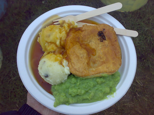
#Hacktoberfest left me feeling mushier than this plate of potatoes and mystery green goo. I want to give a group hug to the world! (Image credit: Flickr user russeljsmith shared with a Creative Commons license)
At least week’s hackfest, I saw so many people celebrating the simple act of creating something that actually worked. It’s a marvel. But the coolest part about this -- and bear with me as I get all mushy here -- was how the act of making something brought people together.

People are makers. We can’t help it. But why? Why do people write, bake, program or paint? 

Here's my best guess: Our minds are lonely places where our thoughts languish. Until, that is, we can turn them into essays, pies, code, pictures -- something another human being can interact with. Making -- whatever it is you make -- is a way of connecting.

Once we know how to make something, we understand it better. We understand the person who made it better. And we understand ourselves better. By learning new ways to make things, we expand what we are able to imagine. The world of possibilities explodes.

Let me defer to my favorite episode of Radiolab to explain. Words. Go listen to it. Right now. Please.

For those of you disregarding my advice...shame on you! But here’s a quick summary: Words aren’t just words -- they are ideas. Before we have the words for a concept, we don’t have the ability to understand it. This has been shown with spatial concepts, time, empathy, all kinds of things. Our ability to think is inseparably bound to language.

What does this have to do with programming? At last week’s hackfest, I realized that programming is the same as writing. Or rather, I was able to map the programming process -- which, previously, I'd found daunting and unwelcoming -- onto a process of making that I find intuitive: writing.

Writing is thinking. And so is programming.
 
Language expands our capacity to understand and interact with the world as beings who can write and speak. And new skills -- for example, programming -- expands our capacity to understand and interact with the world as beings who can make and create. Last week, by getting better acquainted with some of the basic building blocks of a program -- code, logic, how different elements interact -- I was able to imagine possibilities that I couldn’t before.

And that’s why I want to learn more. Now I’m hooked.

I’m inspired to continue to expand my skills as a programmer -- which is really just expanding my skills as a thinker and a maker. So what are my next steps?
  1. I’ve been working through Nathan Yau’s new book, Visualize This. I’m about halfway through, and my feet are appropriately wet with some Python, JavaScript and R. I want to keep going. Then go further.
  2. I started an intro to computer science class from MIT’s open courseware. I really enjoyed the first problem set. A lot a lot. But then I stopped. So I’m going to finish it.
  3. I want to apply what I’m learning through real projects. For me, that probably means data visualization.
Any other suggestions?

I’m amazed the diverse backgrounds of the #hacktoberfest participants. As Nicola mentioned in her blog, many people who are verifiable coding ninjas don’t have any formal background in CS or don’t work as programmers. So, it’d be interesting to, as a way of motivating others to take the plunge, collect stories about how people got into programming.

Here comes the audience participation part:
  • How did you first learn to code?
  • What was the first piece of code you wrote that you were really, truly proud of?
Maybe if more people heard those stories from seasoned (and enthusiastic) programmers, they might understand why it's a skill everyone can benefit from learning.

Saturday, October 01, 2011

Keeping the MoJo Flowing: Blog posts I want to write about #hacktoberfest

While I was flying home from Berlin (through a very circuitous route: Berlin --> Warsaw --> London Heathrow --> Denver --> Boulder), I had nearly 24-hours of offline, device-free time to process some of the idea-explosion that happened in my head at the Berlin #hacktoberfest.  I'm back in Colorado now, doing Colorado things like getting an introduction to canyoneering and going to the Great American Beer Festival. But while I still have #hacktoberfest Berlin goodness flooding my brain, here are some discussions I want to continue:
  1.  What does it mean to have a "mosh pit of the minds?" Creative innovation happens when you mash disparate people, ideas and fields together and watch the sparks fly. What are some other mind-moshes we could try (technology + gastronomy, journalism + adventure sports)?
  2. The two functions of data visualization. Data visualization can be used to explore large and unwieldy datasets for patterns and meaning. They can also be used to communicate information quickly and simply. Are the tools that you need for exploratory and communicatory data visualization the same, or are they distinct?
  3. Building the best "tool box." At #hacktoberfest, I kept hearing the concept of a tool box (for journalists, for developers, for storytellers, for data visualization creators) being discussed. (Note: I prefer "bag of tricks" to tool box, because it includes the tools and the skills you need to use them.) What are the different "tool boxes" we should be making, and how can we make them in an open, extensible way?
  4. Instead of creating a "GitHub  for storytelling," what if we just started using GitHub as a reporting tool? I want to do a test case where, as I'm reporting and writing a story, I put all of my materials (notes, audio recordings of interviews, pictures, etc.) up on a GitHub repository. After the story is done (or during, if it isn't a sensitive story), make the repository public. Insta-open-reporters'-notebook!
  5. What is a story to you? In Berlin, we talked over and over about the importance of stories. Data visualizations are meaningless if they don't tell a story. Information needs context and narrative. But what exactly are we talking about when we talk about stories? I'd like to crowd-source this by putting a call out on Twitter asking people to answer the question: "What is a story?" in 140 characters. Then it would be fun to make some visualizations of the responses.
I hope to turn each of these into a blog post in the near future. I have lots of ideas (seven more, at the moment) that I'll add to the list when I get a chance, but first -- to Denver, to drink delicious craft beers!

    Monday, August 08, 2011

    #MozNewsLab Proposal: The Infinite Story

    The Infinite Story is a tool for opening up reporters’ notebooks and encouraging others to re-mix, mash-up, and extend news stories. Kind of like GitHub, but for storytelling.


    MoJo Pitch: The Infinite Story from Jordan Wirfs-Brock on Vimeo.

    BUSINESS BRIEF

    The Problem
    The news-cycle is dominated by an antiquated artifact: the article. Stories are imprisoned within this format. A story is a living, breathing entity that exists within a thriving idea-rich community. An article is a bounded, disposable snapshot of an unbounded story.

    The Solution
    The Infinite Story frees stories from the constraints of the article by hosting news on in a collaborative storytelling and engagement platform. It’s unique because it doesn’t treat writing and reading as two separate acts, but as elements of a single, iterative storytelling process.

    Why would newsrooms use it?
    To move forward in the digital age, newsrooms must collaborate - with fellow journalists, other newsrooms, and engaged readers. The Infinite Story helps journalists do their jobs while simultaneously fostering sticky engagement with a community of readers.

    Who will benefit?
    The Infinite Story is a tool for both readers and writers of the news. The storytelling process isn’t “report, write, publish, repeat” - it’s information gathering, synthesizing and sharing in a continuous loop. By opening up this process, The Infinite Story benefits news-makers and news-readers.

    Competitors + existing tools/platforms
    Tools for storytelling and information sharing exist, such as wikis, Wordpress, SharePoint, Dropbox, Buzzdata, DocumentCloud, Floss Manuals, Booki and Storify. Content management systems are designed to facilitate collaborative storytelling. There are opportunities for leveraging these tools, instead of competing with them, through feeds and APIs.

    What will distinguish The Infinite Story, and be the key to its success, will be its ability to engage a community of open and collaborative storytellers.

    DESIGN DOCUMENT

    How does it work?
    The Infinite Story has three components:

    1. An open digital reporter’s notebook
    Professional and citizen journalists can upload reporting materials - notes, audio interviews, video, photos, data files, links, documents, contact information. It helps reporters visually organize and tag information during the reporting and writing process, helps co-authors share materials on collaborative projects, and helps readers see how a story was created by getting a deep, behind the scenes view.

    2. A visual story builder
    Reporters can drag and drop elements from their notebook to construct a narrative and write around it, the same way Storify lets you write around tweets. Many writers use some kind of visual structure - for example, notecards with quotes/themes/scenes they can move around. This is a digital version of that process.

    3. A community for social reading mirroring the functionality of GitHub
    Readers can share a story or contribute primary sources of information. Highly engaged readers can “fork” the story by cloning the raw materials into a new projects they can extend by adding their own reporting and writing. The original author can track the life of the story - who’s sharing, adding, or forking.

    Explore a prototype of The Infinite Story created around a real article + raw materials. [Caveat: I’m neither programmer nor designer. This is a *very rough* mock-up.]

    When you are viewing a story, you can see a story view or a notebook view. This is the story view.
    This is the notebook view.
    Once you've forked a story, you see a "dashboard" view that includes a notebook and a story builder.


    How could this leverage newsroom infrastructure?
    Articles published in traditional online formats could link to The Infinite Story. The traditional article doesn’t need to disappear: It’s the window through which readers access the back-channels. The Infinite Story will create modular, exportable content. Writers composing articles can feed that content back into a newsroom’s CMS.

    How would it be integrated into newsroom operations?
    Many journalists I’ve spoken with expressed the need for a tool to organize their materials, both for their own personal writing process and for collaborative projects where they need to share materials. Because The Infinite Story integrates the writing and reading processes, reporters can use it at all stages storytelling. If they are using it to organize their reporting notes and raw materials, no additional effort is needed to share those with readers.

    How would this be built collaboratively?
    In the prototyping process, I incorporated story notes and media from a working journalist to guide the project design. This should be done on a broad scale with reporters, editors, newsroom developers, and news readers. The Infinite Story will be developed using an iterative process centered on user experience. The design process should recognize that writers become readers and readers become writers.

    Challenges
    The biggest challenges surrounding The Infinite Story are behavioral, not technological. Although reporters’ notes are designed to be open and transparent, there are reasons newsrooms might object to sharing them:

    1. Sharing notes and interview recordings might compromise a story.
    It could violate the trust or safety of a source. Or make it harder to continue reporting on the story by clamping up other sources. In some cases, competition might be a legitimate concern for limiting transparency.

    2. Reporters’ notes are often cryptic and hard for anyone other than the author to read.
    Reporters need to write things quickly, and don’t always have time to type up notes or transcribe interviews.

    Issues related to (1) can be addressed with fully controllable permissions and access controls. Notes could be shared internally during newsgathering and writing, then publicly after the story goes live.

    Issues related to (2) can be addressed by integrating tools journalists already use to do their work. The Infinite Story should free up time, not consume it. For example, if journalists are already using Flickr or Dropbox, pictures and files from those accounts should be fed directly into The Infinite Story.

    Questions
    How is this different from a wiki or CMS?
    An essential part of journalism is taking complex information and turning it into a clear, coherent narrative. The Infinite Story values the integrity of narratives by allowing stories to be cloned/forked. A single story can give rise to many narratives. Each one should be respected.

    Do people really want to mash-up stories?
    There’s only one way to find out: Give people the tools to do it and see what happens. Story mash-ups present new opportunities for user engagement.

    Wednesday, August 03, 2011

    Reading list time!

    Here are some things that have inspired my thought process for #MozNewsLab (many suggested by fellow labbers):

    Use Cases for The Infinite Story

    Participating in the #MozNewsLab is an amazing resource. It gives us an opportunity to open up our ideas - and our process - to scrutiny in the best possible way.

    Here's some feedback I got from one Pippin Lee on my second blog assignment:

    If you have time, here's a fairly quick, but interesting challenge that may help you focus any ideas you have...The goal: to give your product/idea a specific use case (don't be afraid of the edge-case subject either!). Here's an example. You can easily do this for all ends of the spectrum, but you'll begin to see how you are able to get deeper into understanding how and what you idea/product will face.

    The goal: Define, "What is your point of view?"
    The formula: [USER] needs [VERB] because [INSIGHT]

    Here's what I came up with as use cases for my project [click to biggerize!]:


    And here's a text version:
    1. A team of journalists collaborating on a story needs to share, catalog and organize files and information because writing a story together requires melding of the minds on a tight deadline.
    2. A writer working on a long or complex story needs to digitally organize reporting materials to track themes, insights and connections because she is working on many stories at once and wants to be able to dive back in to her thought process right where she left off.
    3. An interested reader needs to connect to raw materials and resources because she wants to go deeper after reading a story and has questions that aren’t answered fully in the published story.
    4. A newsreader-turned-newsmaker needs to access to reporting materials and deep background information because she wants to reinterpret them in the context of her own community by writing an expanded story on the same theme.
    Are these the right use cases? What other ones can you suggest? As always, I'd love any thoughts/feedback.

    Monday, August 01, 2011

    Baking a Journalism Cake...Together


    When Mohamed Nanabhay said this, he was talking about creating an environment for readers of news. But I think the same principle can and should be applied to and creating an environment for journalists and gatherers, tellers and sharers of news.

    Simultaneous serendipity and purposefulness is the heart of any creative process. This is especially true for collaborations. Collaborations are so powerful - that is, when they don't succumb to hazards - because:
    1. The sum truly can be bigger than the parts. (This is where purposefulness comes in.)
    2. News ideas proliferate when disparate elements (people, ideas, circumstances, experiences) collide. Unexpected juxtaposition fuels creativity. More people, more new ideas.
    Here’s the really exciting part: These features of the creative process happen whether collaborations are in-person or online.

    This was my serendipitous Sunday.

    My project - The Infinite Story, GitHub for Storytelling, whatever you want to call it - revolves around collaboration. It’s about freeing the journalism process from things that bind stories to one person or one team or one publication, ending stories' lives when that person or team or publication moves on to the next project.

    So how do technology skills come into play? In a great (spontaneous and directed) Twitter-sation with @ChrisLKeller and @knowtheory last week, we discussed the collaborative processes and tools that teams of journalists use.

    We realized: In journalism, in order to share the storytelling process, you have to share the news gathering process. You can’t bake a cake if you don’t have he ingredients. (You might still be able to frost a cake, but that’s a discussion for another day.)
    data cake
    Image by EpicGraphic

    In my experience with collaborative investigative journalism, we've used a muddled system of Google Docs to aggregate reporting materials. It wasn’t a “new” technology for anyone on the reporting team. But logging and sharing all of our reporting material in it was new.

    Adopting a new technology-based newsroom tool isn't necessarily a question of technical capacity, but a question of time and workflow.

    If a tool is useful, usable and desirable, newsrooms will take the time to incorporate it into their workflow. If it's not, they won't. Infinitely more important than how technical you have to be to learn it is whether it enhances journalistic processes (does it reinforce the good habits, eliminate the bad ones).

    So that is how I hope to address varying technical capacity. Yes, I want to make a tool that's as easy to use as possible (I'm thinking of a visual organization for story materials, plus a visual way to share/fork them), but ultimately the tool must enhances the newsroom flow:
    Another project sketch...does visual = easy to use?

    If adopting a new technology - and adapting your process to it - takes so much time that it doesn’t afford room for spontaneous discovery (and the targeted exploration of those discoveries), than it does more harm than good. But if it frees up time for spontaneous discovery, it's an invaluable addition.